No one lives like you
Inspiring Design For Life
Inspiring Design For Life
פרויקטים
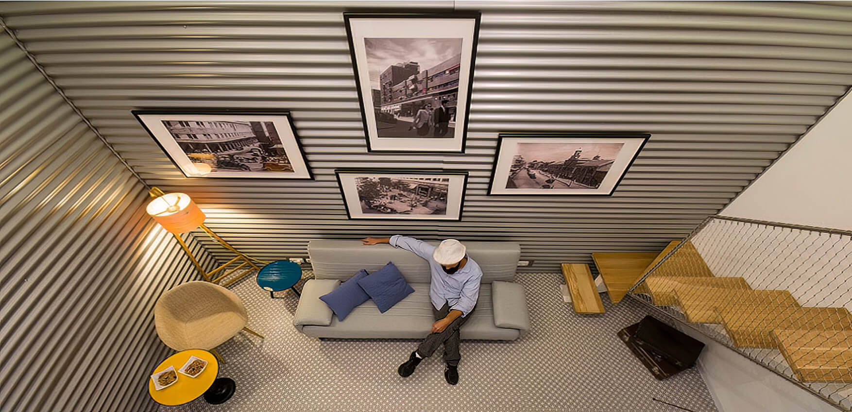
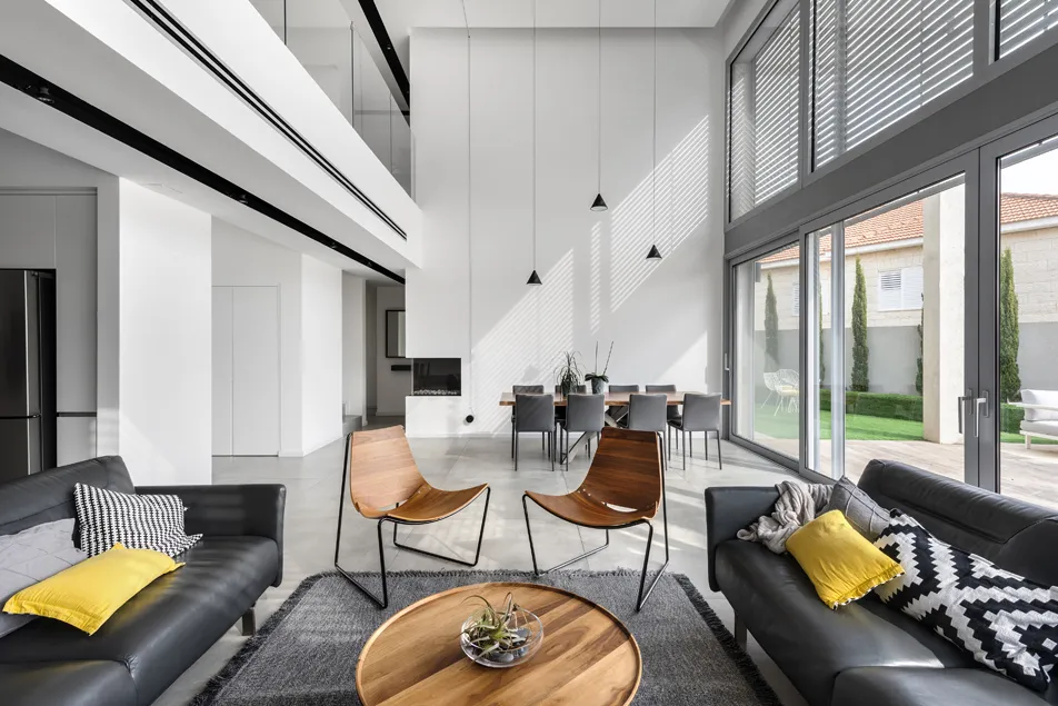
- 01 עיצוב וילה בצפון
- 02 עיצוב וילה במושב
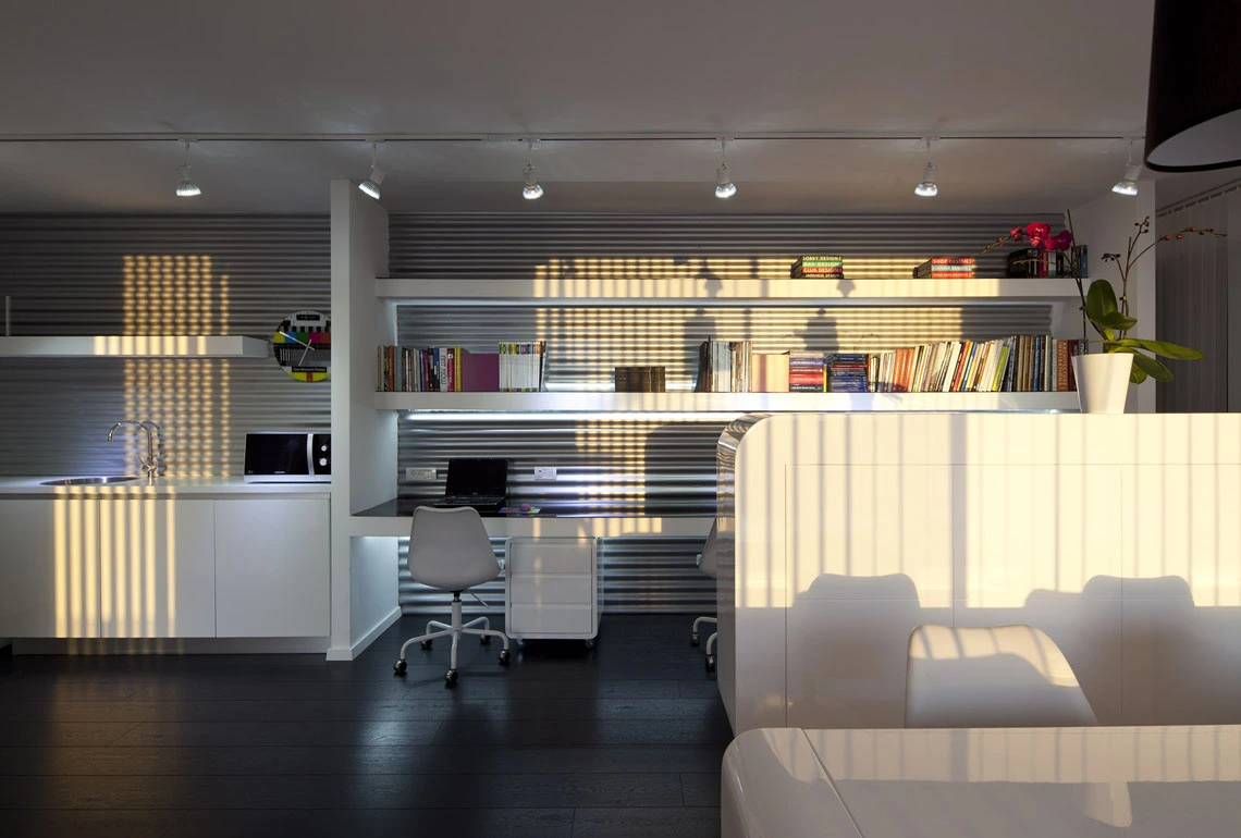
- 03 עיצוב דירת קבלן
- 04 עיצוב פנים בחיפה
- 05 עיצוב מספרה
- 06 עיצוב פנים בצפון
- 07 עיצוב משרדים
God is in the details
God is in the details
בלוג
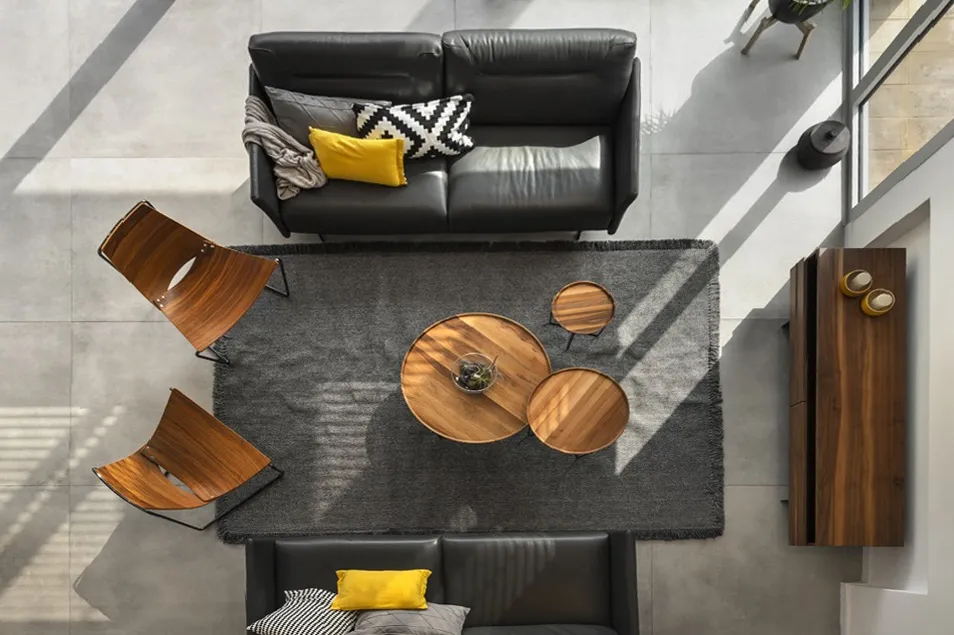
- 01 עיצוב המטבח
- 02 עיצוב לובאיים
- 03 עיצוב משרדים
- 04 עיצוב חדרי ילדים
- 05 עיצוב הבית
- 06 הום סטיילינג לבית
- 07 עיצוב דירה לדוגמא
השירותים שלנו
We love design
We love design
אודות
25 שנים של נסיון!
עיצוב פנים ייחודי המותאם עבורכם באופן אישי.
הילית קרש – מעצבת פנים, בעלת משרד עיצוב פנים מוביל ומצליח, בעלת ניסיון רב בעיצוב דירות, וילות, צימרים ויחידות אירוח, חנויות, משרדים ולובאים במגדלי מגורים גבוהים. ניסיון רב בעבודה עם יזמים מובילים בישראל וקבוצות נדל"ן.
יש לי תשוקה ואהבה גדולה לתחום עיצוב פנים ותכנון, אשמח להיות חלק מהתהליך המרגש שלכם.
קראו עוד
...My favorite project is
...My favorite project is
My Designs your way
My Designs your way
תודות
תודה ללקוחותי הנאמנים שהולכים איתי כברת דרך ארוכה, הנותנים לי חופש ליצור ולהוביל ומעריכים את עבודותי, כותבים לי וממליצים עלי בחום.
תודה על הפרגון הבלתי פוסק. אף פעם זה לא מובן מאליו. אתם נותנים לי את הכוח להצליח וליצור.
לקוחות ממליצים